Hue Florals
Hue Florals came to me seeking a brand evolution that felt elevated while staying true to the artistic heart of the business. The original logo held deep sentimental value, but it was time for a refresh that reflected how the brand had matured.
The logo mark - like Matt’s designs - is inspired by the clean lines and structure of brutalist architecture and the organic nature of plant cells. Structure meets nature, masculine meets feminine - just like Hue floral designs.
The result is a refined identity that lets the florals shine as the true centerpiece, supported by a brand system that feels both intentional and artful.
Credits
Client: Hue Florals
Animation: Molly Little
Photography: Black + White


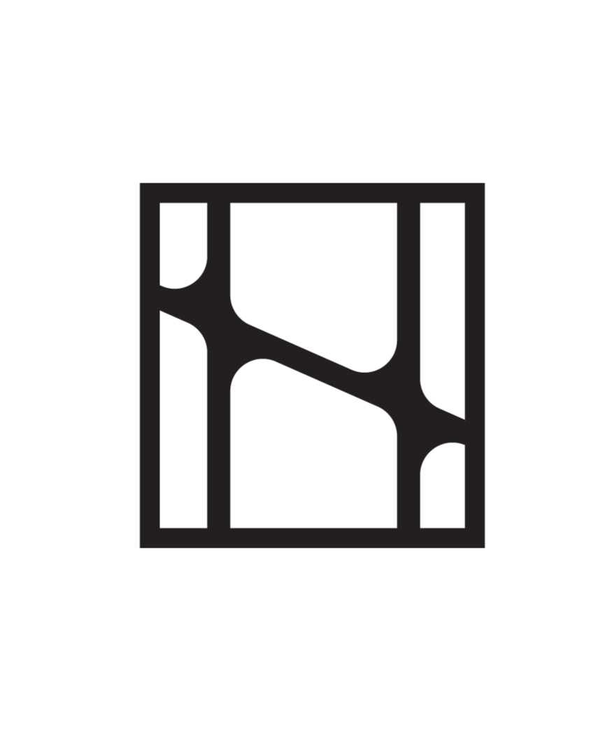
The logo mark is inspired by the clean lines and structure of brutalist architecture and the organic nature of plant cells.


Photo: Black + White


